# pull_down_button
**Repository Path**: imboy-pub/pull_down_button
## Basic Information
- **Project Name**: pull_down_button
- **Description**: 镜像 https://github.com/notDmDrl/pull_down_button.git
- **Primary Language**: Dart
- **License**: MIT
- **Default Branch**: main
- **Homepage**: None
- **GVP Project**: No
## Statistics
- **Stars**: 0
- **Forks**: 0
- **Created**: 2025-07-30
- **Last Updated**: 2025-07-30
## Categories & Tags
**Categories**: Uncategorized
**Tags**: None
## README
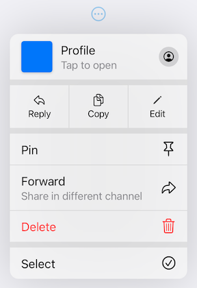
# Pull-Down Button from iOS 14 for Flutter
[](https://pub.dev/packages/pull_down_button)
[](https://pub.dev/packages/pull_down_button)
[](https://pub.dev/packages/pull_down_button)
[](https://pub.dev/packages/very_good_analysis)
[](https://common-changelog.org)
**pull_down_button** is an attempt to bring
[Pop-Up](https://developer.apple.com/design/human-interface-guidelines/components/menus-and-actions/pop-up-buttons) and
[Pull-Down](https://developer.apple.com/design/human-interface-guidelines/components/menus-and-actions/pull-down-buttons)
Buttons from iOS 14+ to Flutter with some additional customisation options.
##### This package only tries to visually replicate the native counterpart, some parts might be somewhat different.
---
### Contents:
- [PullDownButton](#pulldownbutton)
- [PullDownMenuItem](#pulldownmenuitem)
- [PullDownMenuItem.selectable](#pulldownmenuitemselectable)
- [PullDownMenuActionsRow](#pulldownmenuactionsrow)
- [PullDownMenuDivider](#pulldownmenudivider)
- [PullDownMenuTitle](#pulldownmenutitle)
- [PullDownMenuHeader](#pulldownmenuheader)
- [showPullDownMenu](#showpulldownmenu)
- [PullDownMenu](#pulldownmenu)
- [Theming](#theming)
- [PullDownButtonTheme](#pulldownbuttontheme)
- [Contributions](#contributions)
---
## PullDownButton
`PullDownButton` is a widget used to show the pull-down menu.
While the pull-down menu is opened, the button from where this menu was called will have lower opacity.
```dart
PullDownButton(
itemBuilder: (context) => [
PullDownMenuItem(
title: 'Menu item',
onTap: () {},
),
const PullDownMenuDivider(),
PullDownMenuItem(
title: 'Menu item 2',
onTap: () {},
),
],
buttonBuilder: (context, showMenu) => CupertinoButton(
onPressed: showMenu,
padding: EdgeInsets.zero,
child: const Icon(CupertinoIcons.ellipsis_circle),
),
);
```
Properties table
| Properties | Description |
| -------------------------- | -------------------------------------------------------------------------------------------------------- |
| itemBuilder | Called when the button is pressed to create the items to show in the menu. |
| buttonBuilder | Builder that provides `BuildContext` as well as `showMenu` function to pass to any custom button widget. |
| onCanceled | Called when the user dismisses the pull-down menu. |
| position | Whether the pull-down menu is positioned above, over, or under the pull-down menu button. |
| itemsOrder | Whether the pull-down menu orders its items from `itemBuilder` in downward or upwards way. |
| buttonAnchor | Whether the pull-down menu is anchored to the center, left, or right side of `buttonBuilder`. |
| menuOffset | Additional offset for the pull-down menu if the menu's desired position. |
| scrollController | A custom menu scroll controller. |
| animationBuilder | Custom animation for `buttonBuilder` when the pull-down menu is opening or closing. |
| routeTheme | The theme of the pull-down menu box. |
| animationAlignmentOverride | Custom animation alignment used to override default one. |
| useRootNavigator | Whether to use the root navigator to show the pull-down menu. |
| routeSettings | Optional route settings for the pull-down menu. |
Properties table
| Properties | Description |
| ------------- | ------------------------------------------------ |
| onTap | The action this item represents. |
| tapHandler | Handler to resolve how `onTap` callback is used. |
| enabled | Whether the user is permitted to tap this item. |
| title | Title of this `PullDownMenuItem`. |
| subtitle | Subtitle of this `PullDownMenuItem`. |
| icon | Trailing icon of this `PullDownMenuItem`. |
| iconColor | Trailing icon's color. |
| iconWidget | Custom trailing widget. |
| isDestructive | Whether this item represents destructive action. |
| itemTheme | The theme of the menu item. |
Properties table
`PullDownMenuItem.selectable` uses all of `PullDownMenuItem` properties as well as a boolean value `selected`, to indicate whether the menu item is selected or not.
Properties table
| Properties | Description |
| -------------- | ------------------------------------------------ |
| onTap | The action this header represents. |
| tapHandler | Handler to resolve how `onTap` callback is used. |
| leading | Leading widget of this `PullDownMenuItem`. |
| leadingBuilder | Custom leading widget of `PullDownMenuHeader`. |
| title | Title of this `PullDownMenuItem`. |
| subtitle | Subtitle of this `PullDownMenuItem`. |
| itemTheme | The theme of the menu item. |
| icon | Trailing icon of this `PullDownMenuItem`. |
| iconWidget | Custom trailing widget. |
Properties table
| Properties | Description |
| ---------------- | ------------------------------------------------------------------------------------------- |
| context | For looking up `Navigator` for the menu. |
| items | List of `PullDownMenuEntry` widgets. |
| position | The `Rect` is used to align the top of the menu with the top of the **position** rectangle. |
| itemsOrder | Whether the popup menu orders its items from `itemBuilder` in a downward or upwards way. |
| menuOffset | Additional offset for the pull-down menu if the menu's desired position. |
| scrollController | A custom menu scroll controller. |
| onCanceled | Called when the user dismisses the pull-down menu. |
| routeTheme | The theme of the pull-down menu box. |
| useRootNavigator | Whether to use the root navigator to show the pull-down menu. |
| routeSettings | Optional route settings for the pull-down menu. |
Properties table
| Properties | Description |
| ---------------- | ------------------------------------ |
| items | List of `PullDownMenuEntry` widgets. |
| scrollController | A custom menu scroll controller. |
| routeTheme | The theme of pull-down menu box. |
PullDownButtonTheme
| Properties | Description |
| ------------ | --------------------------------------------------------- |
| routeTheme | Menu container theme (`PullDownMenuRouteTheme`). |
| itemTheme | `PullDownMenuItem` theme (`PullDownMenuItemTheme`). |
| dividerTheme | `PullDownMenuDivider` theme (`PullDownMenuDividerTheme`). |
| titleTheme | `PullDownMenuTitle` theme (`PullDownMenuTitleTheme`). |
PullDownMenuRouteTheme
| Properties | Description |
| ------------------ | ------------------------------------------- |
| backgroundColor | The background color of the pull-down menu. |
| borderRadius | The border radius of the pull-down menu. |
| shadow | The pull-down menu shadow. |
| width | Pull-down menu width. |
| accessibilityWidth | Pull-down menu accessibility width. |
`backgroundColor` usually has opacity in the range of **0.7-0.8** so that menu has a blur effect.
If `backgroundColor` is fully opaque (opacity set to **1**), no blur effect will be applied.
PullDownMenuItemTheme
| Properties | Description |
| ------------------------ | ----------------------------------------------------------------- |
| destructiveColor | Color for destructive action. |
| checkmark | Checkmark icon. |
| textStyle | `PullDownMenuItem` text style. |
| subtitleStyle | `PullDownMenuItem` subtitle text style. |
| iconActionTextStyle | `PullDownMenuItem` text style inside of `PullDownMenuActionsRow`. |
| onHoverBackgroundColor | On hover color of `PullDownMenuItem`. |
| onPressedBackgroundColor | On pressed color of `PullDownMenuItem`. |
| onHoverTextColor | On hover color of text of `PullDownMenuItem`. |
PullDownMenuDividerTheme
| Properties | Description |
| ----------------- | -------------------- |
| dividerColor | Small divider color. |
| largeDividerColor | Large divider color. |
`largeDividerColor` is usually lighter than `dividerColor`.
PullDownMenuTitleTheme
| Properties | Description |
| ---------- | ------------------------------- |
| style | `PullDownMenuTitle` text style. |